[ The problem ]
Dating apps optimize for the swipe. PULSE optimizes for the meet-up.
Generic dating apps reward photogenic profiles, not compatible humans. They strip context — what someone actually does all week — and replace it with a photo grid plus 250-character bio. Conversion to first date is brutal, and the in-person experience often disconnects from the curated profile.
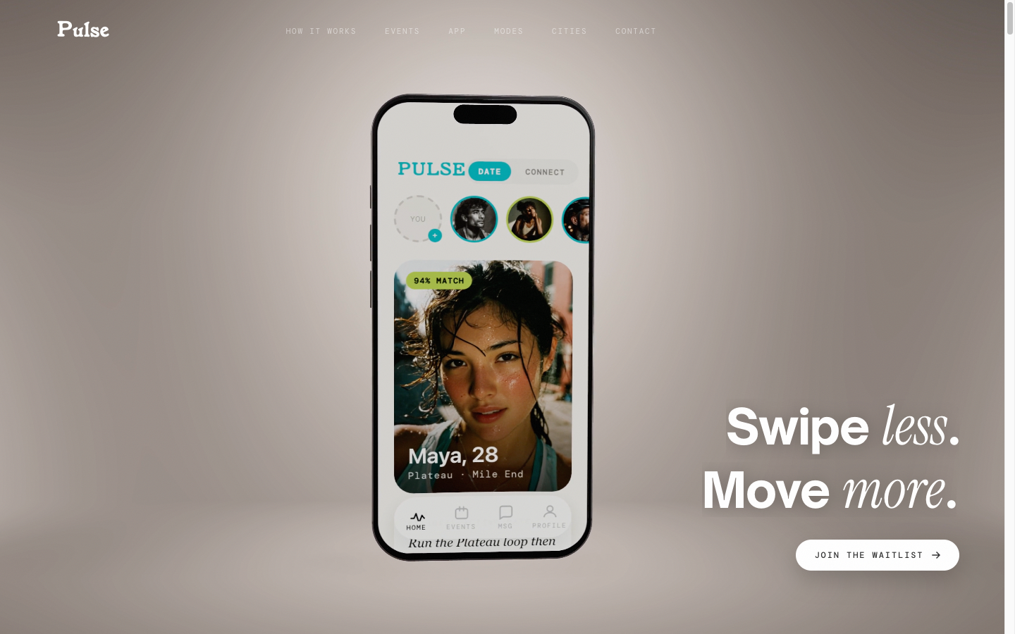
PULSE flips the unit of compatibility from looks to movement. Profiles surface what you actually train: weekly mileage, gyms, run clubs, climbing grade, race schedule. Matches happen in the context of an event — "run the Plateau loop Thursday 6am" — not a photo carousel. Two modes: Date for couples, Connect for training partners.
[ Approach ]
Editorial brand language usually reserved for run clubs, on a swipe-app frame.
Visual reference set was UVU, Bandit, Satisfy — flash-photographed motion blur, dark editorial palettes, magenta pops, no Instagram-pastel softness. The site lives at getpulsesocial.com: phone render hero, hand-set serif headline, real user portraits styled as Polaroids with washi-tape framing. The product runs as a native React Native + Expo app on iOS and Android, with Supabase as the backend (Postgres + Storage + Realtime + Edge Functions).
The marketing site is a single self-contained HTML build — fonts inlined as base64 to avoid network jank on first paint, Knorke display for the wordmark, PP Editorial New for body. Heavy use of polaroid frames (real PNG asset, CSS positions live photo at top 7% / sides 7% / bottom 24% behind frame) for an analog, anti-startup aesthetic.
[ Stack ]
[ Scope ]
95%
Native app shipped
2 modes
Date + Connect feeds
iOS + Android
Cross-platform from day 1